
 PREVIOUS : GRIEF — Colors (#1)
SITE : “The COLOR of GRIEF“(celebrity CHEF)
BOOKs :”Colors of Grief ” – Poems
“International Handbook of Art Therapy…..”
COLOR PSYCHOLOGY in Daily Life enhances well-being:
✧ Colorful Self-Expression : Whether through art, fashion, or personal spaces, let your color choices reflect your unique personality & emotions.
✧ Home Decor : Choose colors that align with the atmosphere you want to create. Relaxation = calming blues & greens in your bedroom. Energy & Creativity = add pops of vibrant colors like orange & purple in your workspace
✧ Mindful of Color Choices in your daily surroundings, from the paint on the walls to the artwork you display. Consider the emotional & psychological effects these colors may have on your well-being
✧ Wardrobe Choices : Dress in colors that are comfortable & help you feel confident – to have a positive effect on your mood. Experiment with different shades to match your age, environment & the current emotional state you’re in.
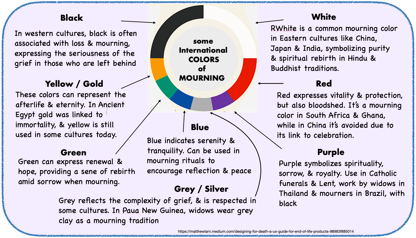
In Psychological Terms – All colors of the rainbow convey grief’s complexity & can be used to gradually move you toward integration : 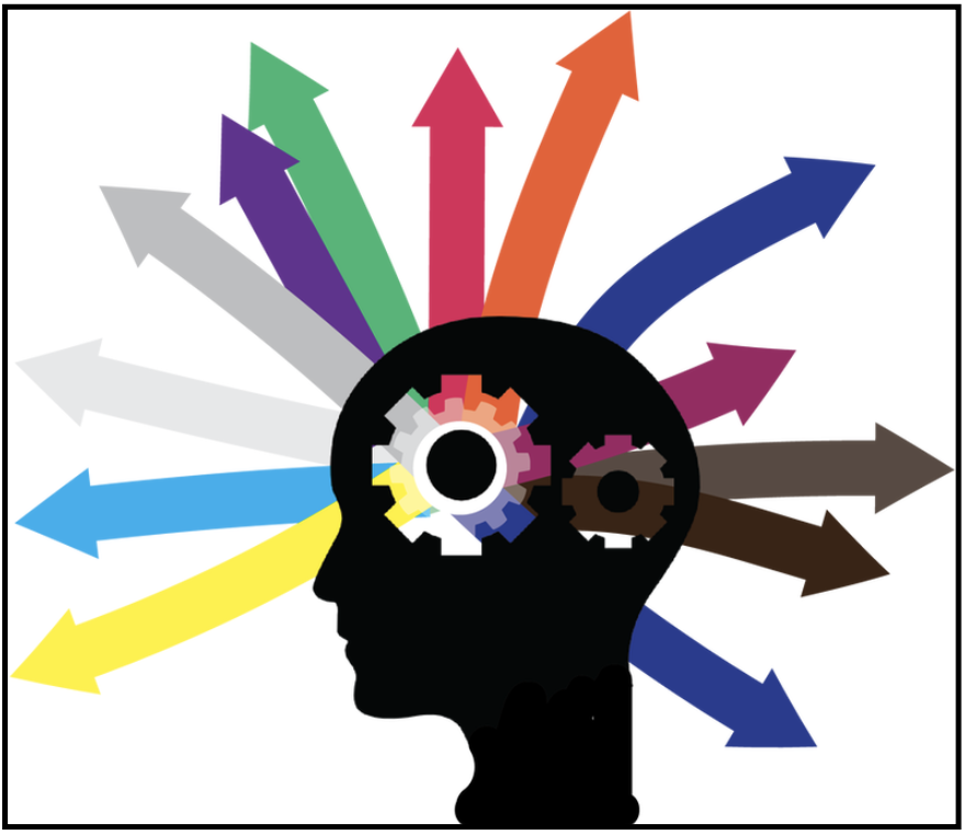
▪︎ Blue channels feelings of sadness that lessen but still linger
▪︎ Green reveals the first buds of new growth & life’s meaning
▪︎ Indigo represents honoring the memory of the loved one, as a reminder that reconnect us to them
▪︎ Orange embodies the frustrations of having to live a ‘new’ way
▪︎ Red represents swirling anger, guilt & agitation
▪︎ Violet & magenta hold the mysteries of why loss occurs, & what dreams can hold
▪︎ Yellow illuminates dawning hope & optimism
GRIEF’s many shades evolve slowly, without a set sequence or time frame, its color palette as varied as human experience itself. Exploring them lets us see into our personal emotional landscape, knowing that some days being easier than others.
Grief is not mono-chromatic, it’s multi-dimensional. Though it may start with darker tones like gray & black, it will gradually incorporate lighter hues like green, yellow, & glimpses of the rainbow. The breadth of options shows the depth of our relationships with the lost one, & the deepest feelings are in technicolor. Colors are the energy-levels we carry in our body & spirit, to help re-assemble the broken pieces of this life we’ve been given.
Grievers can use color to encourage healing by incorporating it into their environment & clothing (but not red or black) : 
❥ Blue: to promote calm & tranquility, & soothe emotional pain
❥ Green: for renewal & growth, encourages healing & hope
❥ Yellow: warmth & positivity, uplifts the spirit in hard times
❥ Purple: for spirituality & introspection, aids emotional processing
❥ White: for purity & peace, for a sense of comfort & clarity
❥ Pink: for love & compassion, fostering self-care & emotional support.
MORE generally, we can choose comforting colors to wear or surround ourself with that are typical in the WEST during grief – no matter how long that is :
❀ Black = Traditionally associated with mourning & loss, especially at funerals, for solemnity & reflecting on the deceased
❀ Soft Blues = Evokes tranquility, helping to soothe emotions
❀ Dark Blue = Represents depth, conveying a sense of calm
 OR
OR
❀ Deep Purple = Linked to mourning, for dignity & respect
❀ Gray = A neutral color that reflects sadness without being too stark – can give a sense of quiet in chaotic times
❀ White = Provides a sense of peaceful solitude
OR
❀ Muted Earth Tones = Browns & greens connect to nature, & can offer grounding & stability
❀ Soft Pastels = Light colors – pale rose & lavenders – a gentle presence without being overwhelming
✹ Avoid Bright Colors, as other mourners or relatives may consider them disrespectful.
However, Although religion & tradition are still important there’s been a change toward personalized funerals as a celebration of life. The deceased may have wished their mourners to wear brights, or the family may request participants to wear a specific color or ribbon in support of a charity. See: ” What to wear to a funeral guide.” 
COLORS not to wear at a wake, memorial or funeral
◘ Bright Reds = In 90% of Western cultures, red symbolizes passion, danger, or celebration – the opposite of mourning.
◘ Neon or Electric Brights = these trigger physical alertness – exactly what grieving brains do not need.
◘ Shiny Metallics = they reflect light 3–5x more than matte fabrics – making the wearer the literal “center of attention” when the focus should be on the casket or family. (MORE….)
GRIEF – Original Debunked
